Ripples'18 Website
January '18 - February '18
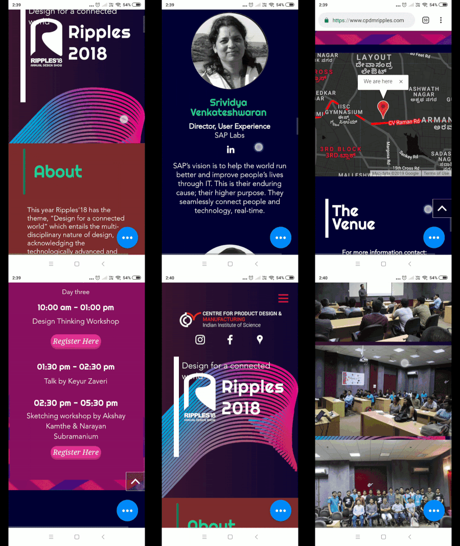
I did Web design for Ripples which is the Annual Design Degree Show of CPDM, IISc. We were a team of two designers for the website team of the Annual event as a part of our design degree show where we showcase our projects built during the course of our master's degree.
We used Wix to make a landing page with event schedules and details of the event. Adobe Illustrator and Photoshop are some software I used to make the assets for the website.
This was my first input in website design and building for an event, so we used Wix to build the design in a time of 1 month along with our academic courses. I knew nothing about website building and took HCI course in my masters program at this time.
Process
01 Project brief
02 Font and Colors
03 Animations
04 Limitations
05 Launch
Project Brief
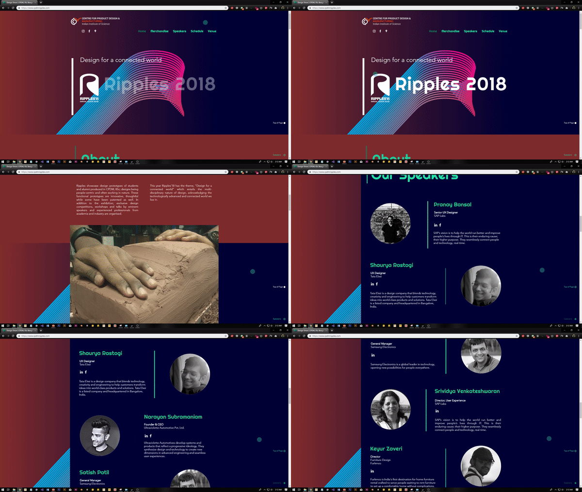
Our aim was to make a landing page for Ripples 2018. Ripples is the Annual Design Degree Show of Centre for Product Design and Manufacturing, IISc. We used Wix website builder to make the website and Photoshop and Illustrator to create the assets.
Theme for the Ripples 2018 was "Towards a Connecting World", so the web design was evolved from the 2018 trend of vibrant colors and white text over dark body.
Font and Colors
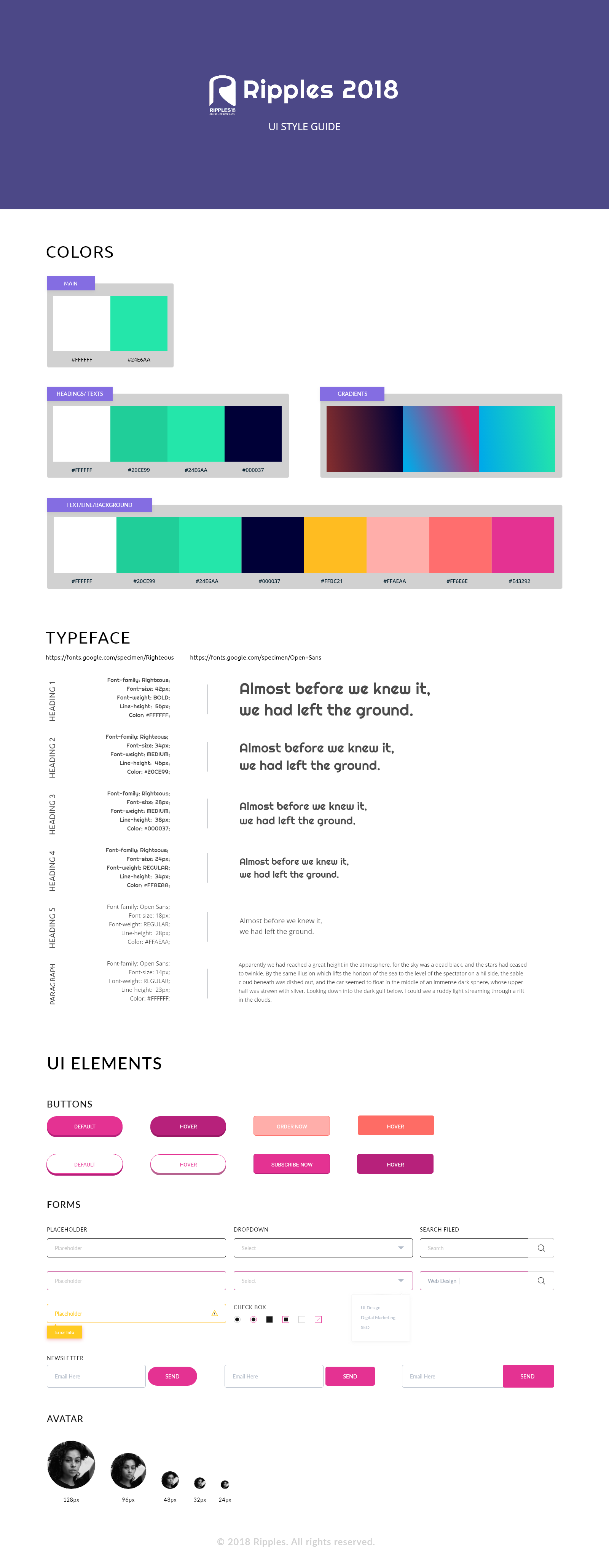
The colors used were in accordance to the Pantone Color of the year 2018 and we visualised the design to have a dark and vibrant effect. We used gradients and flat UI styles with solid borders and solid button shadows.
Following is the Style Guide for UI and overall look of the website.
Animations
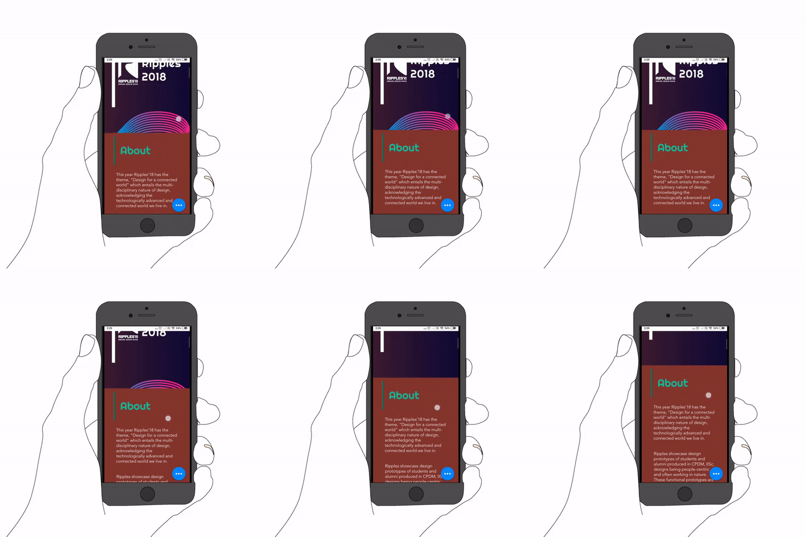
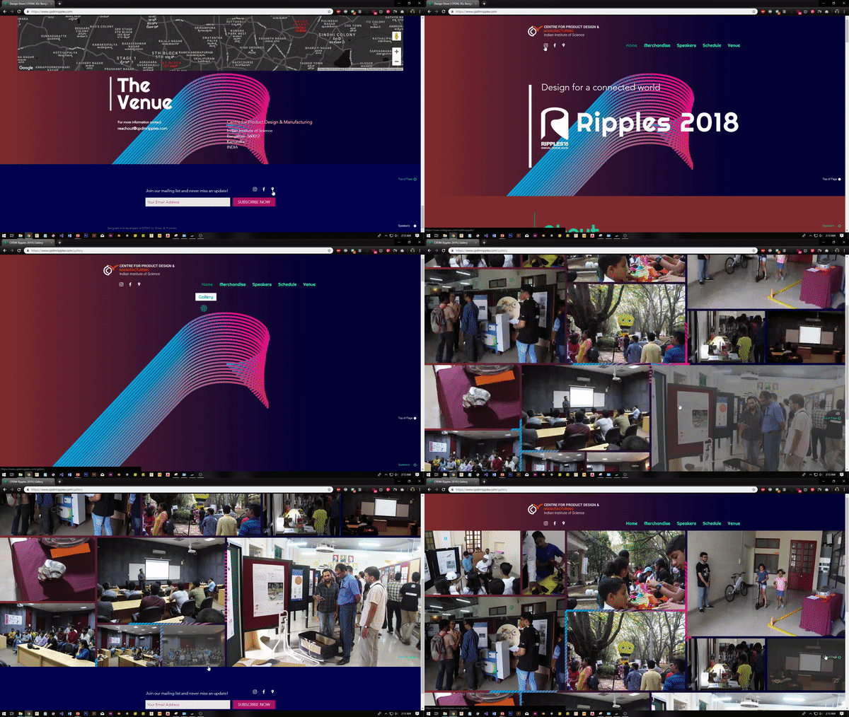
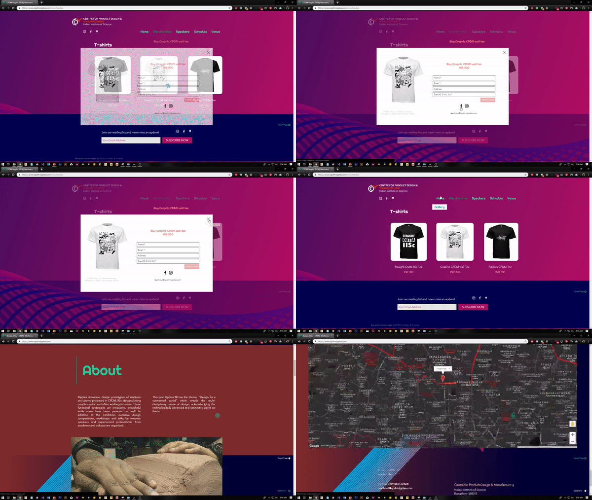
We used preset animations from Wix website builder and used hover CSS animations with ease-in functions for links and button behaviours.
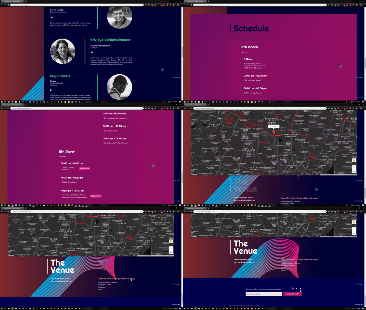
We used Google Map API in dark colors to go with the appearance of the website.
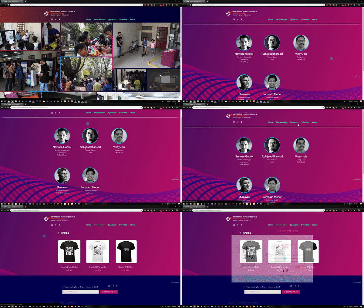
Limitations
We faced limitations with custom-coding small behaviours in CSS and we had to use PhP for directing emails to our google account while we used a trial period mail service by Microsoft 365 due to a limited budget.
Launch
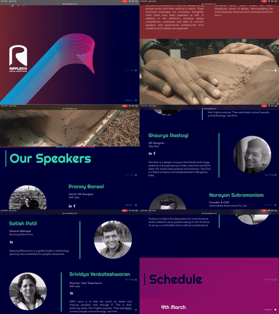
Using Wix made it easier for us to generate a responsive view for phone, tablet and desktop screens.
Below is the iPad Screen
Below is the Phone Screen
